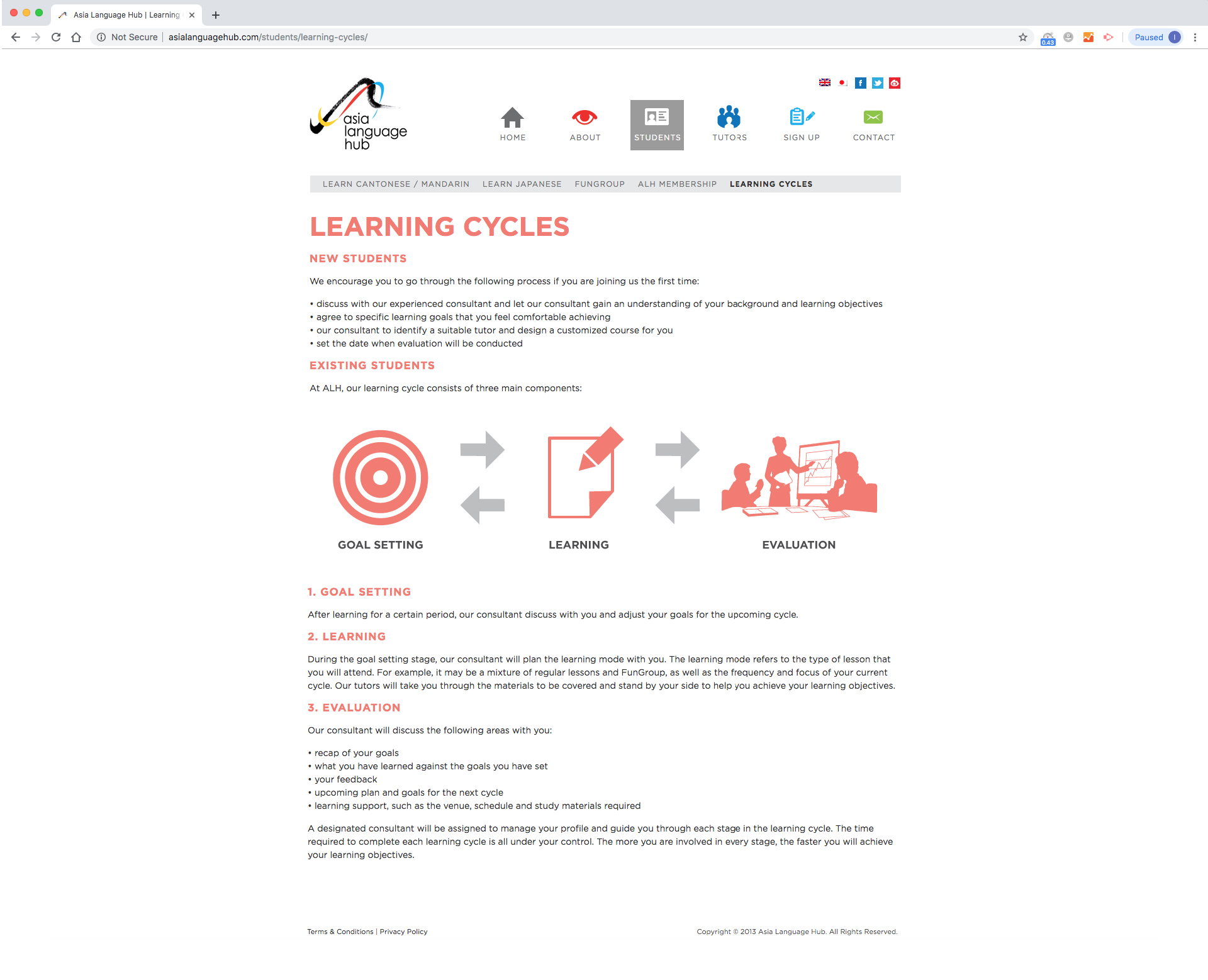
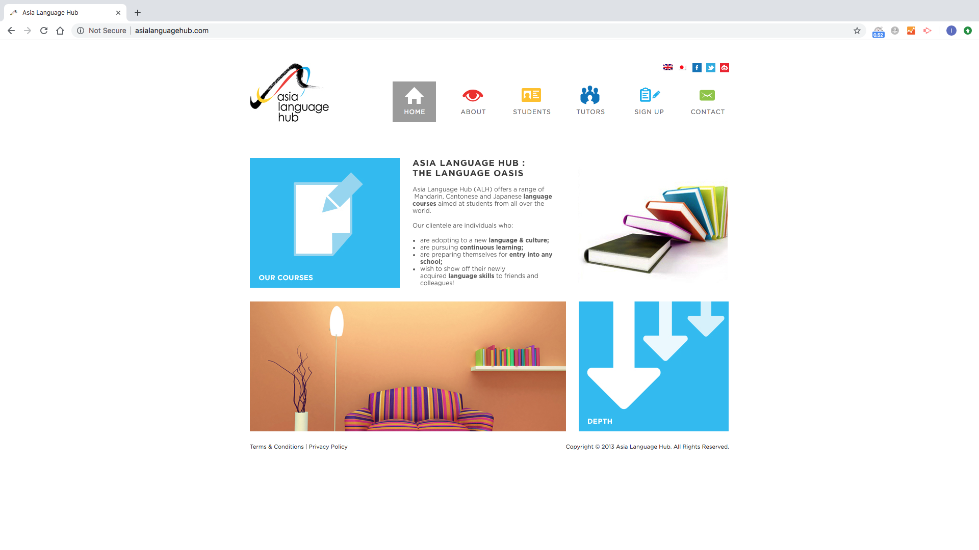
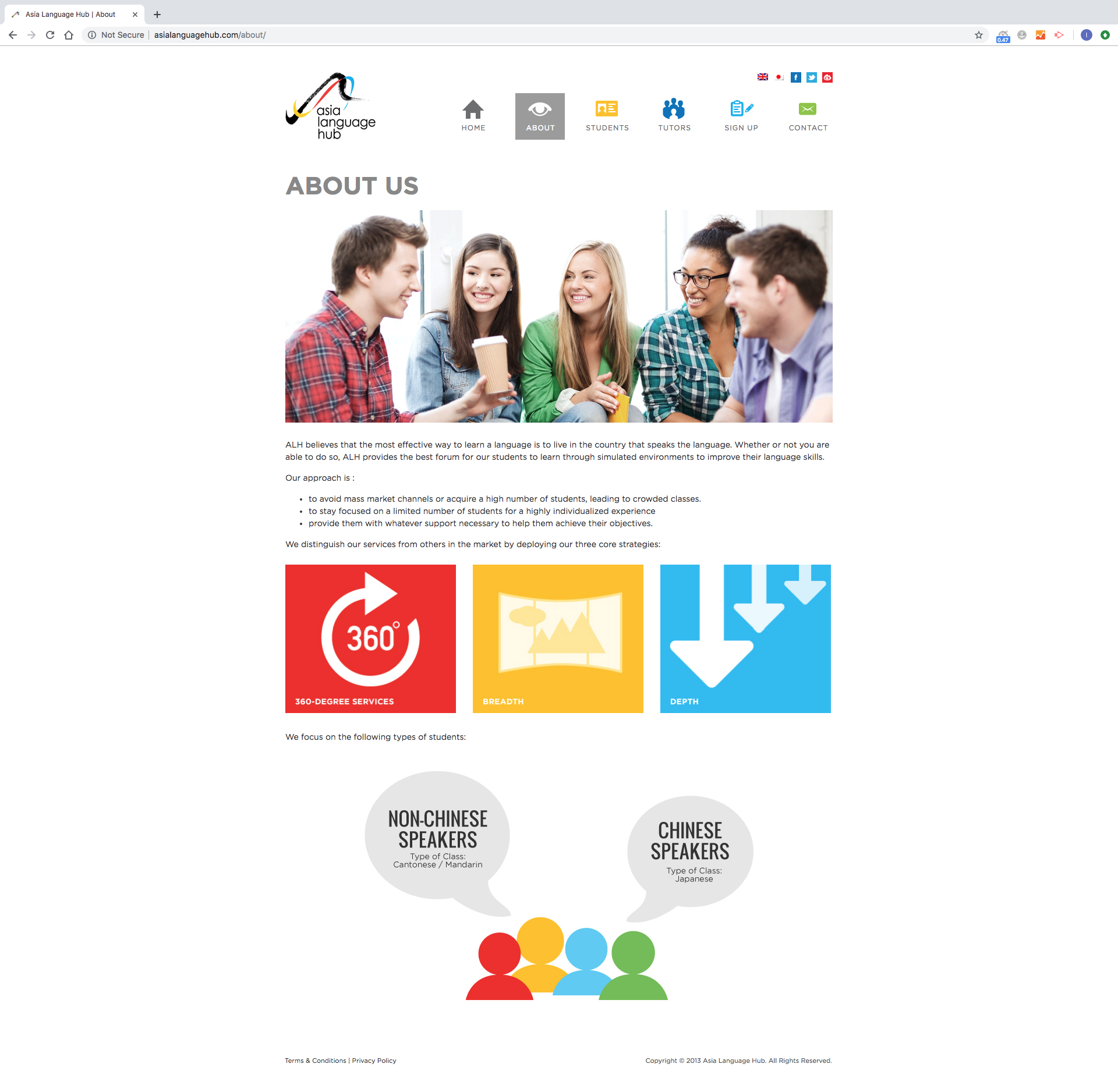
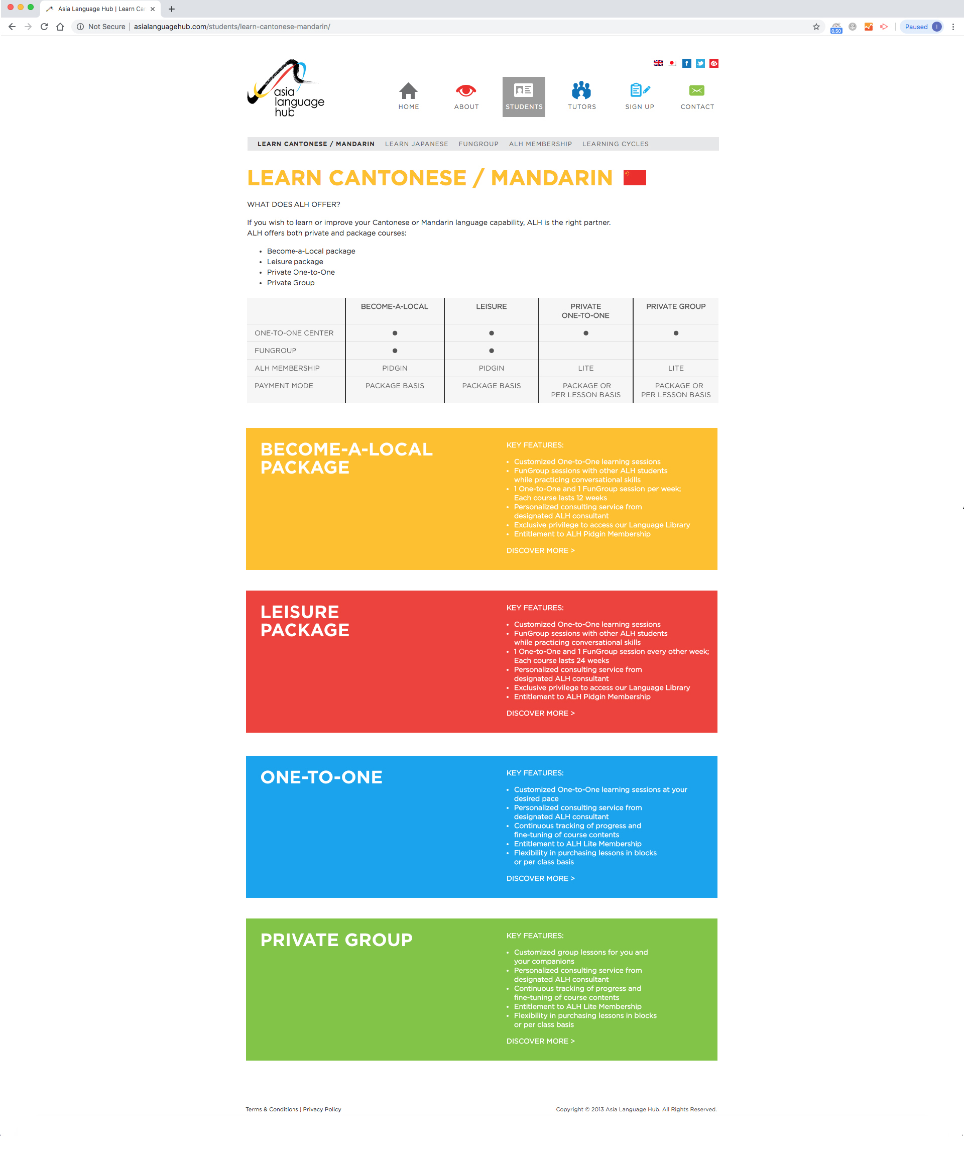
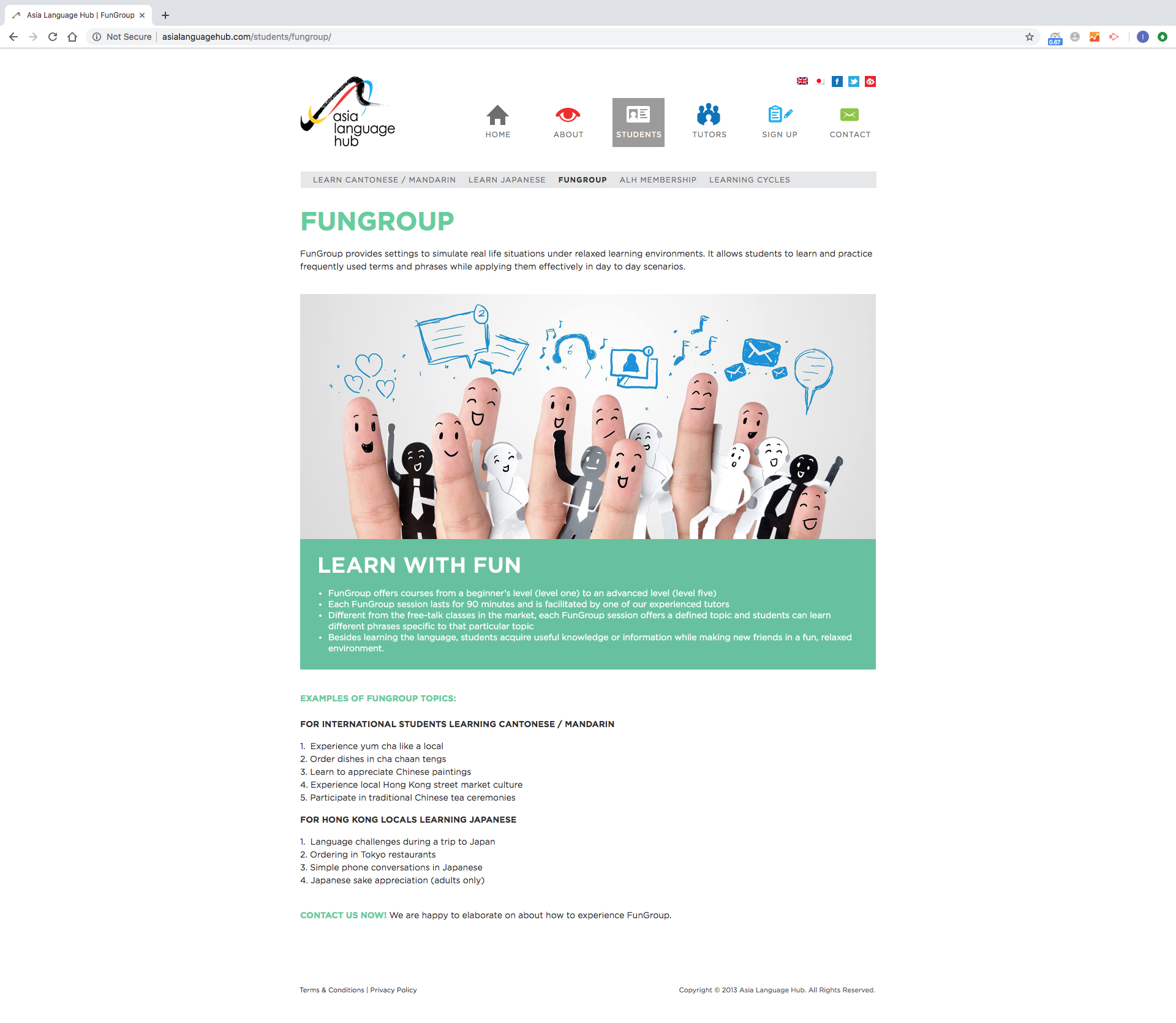
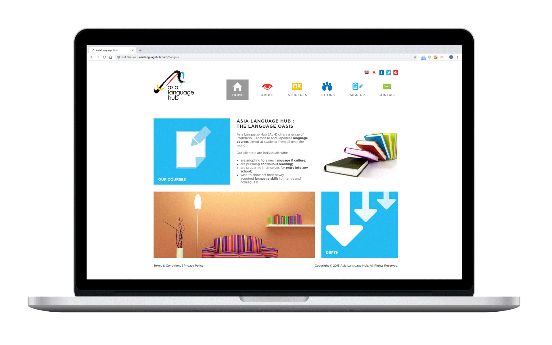
OVERVIEW

Asia Language Hub

We were invited to design the logo and website for the brand new language education centre, “asia language hub” which will provide the platform for the customers to learn the asian language anywhere and having cross culture exchange.

DELIVERABLE
LANGUAGE
TECHNOLOGY

Logo Design (4 Languages)
Asia Language Hub Logo Design

In english, ”pidgin” was a simplified language that develops as a means of communication between the two or more, and related to the word of ”Pigeon”. Pigeon which usually deliver the message to the others. The shape of pigeon has picked up as the element, combined with the Chinese brush stroke and the english pen style for creating the logo with the colours that represent Asia to imply ”east meets west” as the objective of cross culture exchange.

Color Palette
Web Design Interface

In order to let the audiences feel its such mobility and relaxation learning centre, vibrant colour tone, a series of colourful stock photos and illustrations have been applied to the website.

The user-friendly information architecture also being adopted with the content management system developed by wordpress in both english and japanese version.

Asia Language Hub
Asia Language Hub
Asia Language Hub
Asia Language Hub
Asia Language Hub