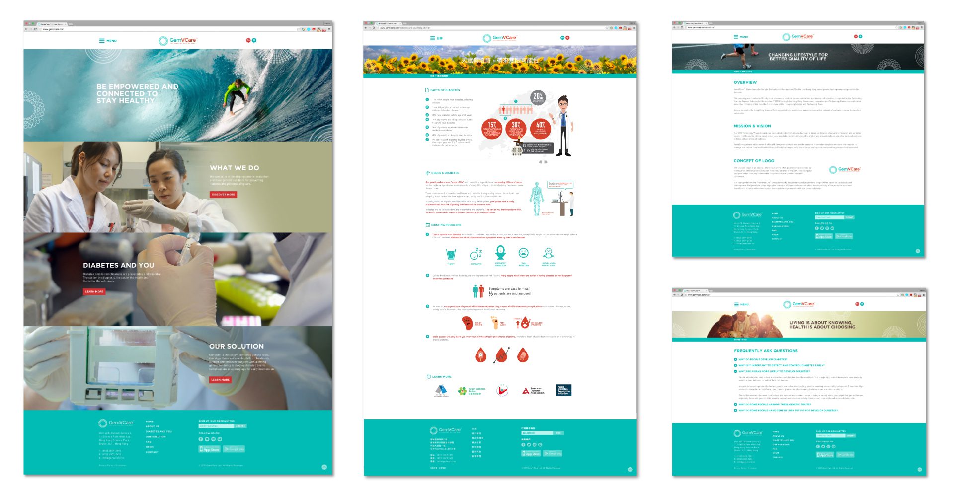
OVERVIEW

GemVCare

The first ever Genetic Testing Company in Hong Kong, GemVCare. They would like to have the professional image and its identity to represent the brand across all the media, including logo, namecard, stationary, website and promotional materials.

DELIVERABLE
LANGUAGE
TECHNOLOGY

Logo Design
GemVCare Logo Design

The octagon shape is an abstract impression of the DNA geometry characterized by the major and minor grooves between the double strands of the DNA. The triangular polygons within the octagon resemble the genetic diversity within a regular framework.

The logo symbolises the ‘Flower of Life’, characterised by the geometry and proportions long admired by artists, architects and philosophers. The gemstone image highlights the value of genetic information whilst the connectivity of the polygons represent GemVCare’s alliance with networks that share a vision to promote health and prevent diabetes.

Web Design
GemVCare Web Design

GemVCare acts like the laboratory of diabetes genetic testing with a group of scientists and doctors to help patiences to predict or prevent diabetes by personalised care services. We mixed the green and red colors to project the mood of laboratory overall on the website. Also, we have employed the taglines with images to show on dedicated pages for reminding the audiences its importance of health care.

The user-friendly interface and information architecture was being adopted with the content management system developed by wordpress in both english and chinese version.

User Experiences
GemVCare Menu
GemVCare Sticky Menu
GemVCare Info. Graphics
Responsive Design
GemVCare